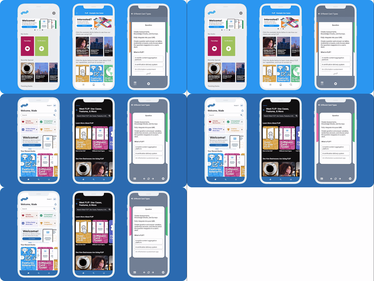
We are excited to release the next generation of FLIP.

By working with clients, surveying stakeholders, and reviewing the current e-learning space, we have created FLIP version 5.0 to:
- Increase user engagement.
- Allow deeper customization.
- Make life easier for users and content managers.
Elevating the App Experience
Modern Design Refresh
The design update standardizes areas of action, improves hierarchy, and allows more accessible, and consistent navigation. Highlights include:
- Dark Mode
- Improved white labeling
- Improved accessibility features
- A new back button plus gesture support
- Better feedback in modals
- Larger promo banners that scale and support GIFs
Homepage Built For You
Notification Feed See when you have unread notifications, access past messages you have received, and sync across all your devices.
A new section focused on the user, their content, and their achievements:

My Favorites Quickly view cards and decks you have saved as favorites, plus access and manage your custom tucked decks. Favorited cards remember the deck they are in, and you can jump to that card immediately. Use the page-specific search to find what you need even faster. With favorites and custom decks, you can make FLIP your go-to app for information anytime, anywhere.
What’s New View the decks that have recently been assigned to you, keeping you updated on all your organization’s recent activity.
Certifications View all the certifications you have earned via FLIP sorted by year.
Competitions See your active competitions and where you have placed in the past.
Personalized Recommendations Homepage recommendations now consider several factors, including popularity amongst your peers, similar content you have spent time viewing, and courses you have completed to surface content you may be interested in but have yet to see.
Smarter, Faster Search
- Search highlights the word or phrase you have entered to easily find what you need.
- Speeds have been increased by 20-30%.
- Search is available at every level of content.
Enhanced Deck Interaction
- Left, Right, and FLIP Buttons allow for quick navigation via the bottom of the screen and more accessible keyboard-only navigation.
- Close Button moved to the bottom right corner for easier reach access.
- The Tuck Card circle button has been updated to a Plus Circle to visualize its function better.
- Deck names and buttons change color to ensure accessibility.
Simplifying the Admin
The admin has been updated to align with a content builder first philosophy. Highlights include:
- A modern design overhaul
- User friendly drop-down menus
- Standardized buttons
- Brand-friendly color picker
- Simplified terminology
Behind the Scenes
The architecture of the app and admin have been optimized to:
- Improve speed
- Lower file sizes
- Better serve content
These updates will come to your app and admin accounts in the coming weeks. Want to learn more or find out how FLIP can help your organization? Contact Us Today!
What’s Next?
- New feedback tools and rating system for decks
- Even more tailored recommendations
- Desktop app enhancements


